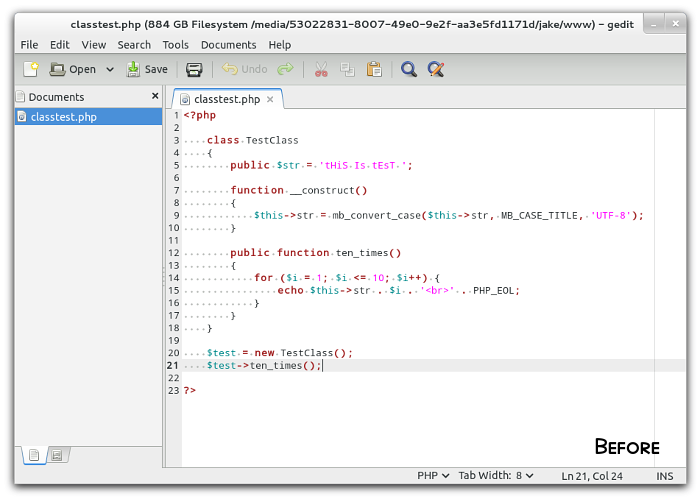
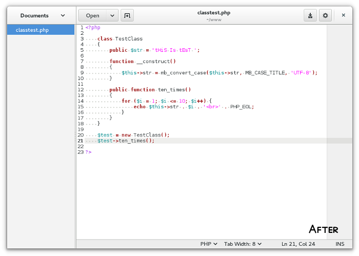
People have been complaining about gEdit 3.12, which recently moved into Debian's "testing" repository. Specifically, they're complaining about the GUI. Many have lamented the old-style icon menu, which was removed, as is similarly being done to Totem (Videos), Nautilus (Files), and Disk Utility (Disks), among others.
Personally, as a programmer, I honestly never used the old menu, I used the keyboard. And quite frankly, programmers -- and otherwise people who write heavily -- are more likely going to prefer pressing Ctrl+P to print rather than clicking the icon, likewise of Ctrl+S, Ctrl+F, etc.
GUI differences for reference...


To people complaining that gEdit 3.12 has removed functionality, I can safely say that isn't true. If you think it is, you're wrong. Any functionality people claim is missing is right there in the little gear button menu, otherwise in Preferences. It's true some old plugins aren't compatible anymore, but they will surely be updated. However, I personally didn't notice any of my plugins stop working. So no missing functionality here.
Working like always...
There is, however, some pretty nifty new features in gEdit 3.12. Specifically, polish, of course. Polish is probably the one word that best describes gEdit 3.12. However, there has also been some useful moving around of useful features. For example you can now change the case of a text selection from the right-click menu. Very useful.
One of the major improvements is the removal (*gasp*) of the old "Highlight Mode" menu. Instead of a huge list of programming language syntax highlighting modes in a menu so long it reaches the top and bottom of the screen, there's now a useful bubble popup with a fixed size. Though that's not all, this new bubble popup lets you search the huge list of programming language syntax highlighting modes. So all you have to do is type "HT" and you see HTML, "J" and you see Java, JavaScript, JSON, you get the idea.

I fail to see what everyone is complaining about. gEdit 3.12 looks fabulous! Better than any previous version. It's useful, minimalistic in design, allows you better focus on what you're writing (as intended), and it saves vertical screen space which is honestly welcomed on my laptop's wide-screen.
My only complaint is the tabs... they don't look like TABS!
